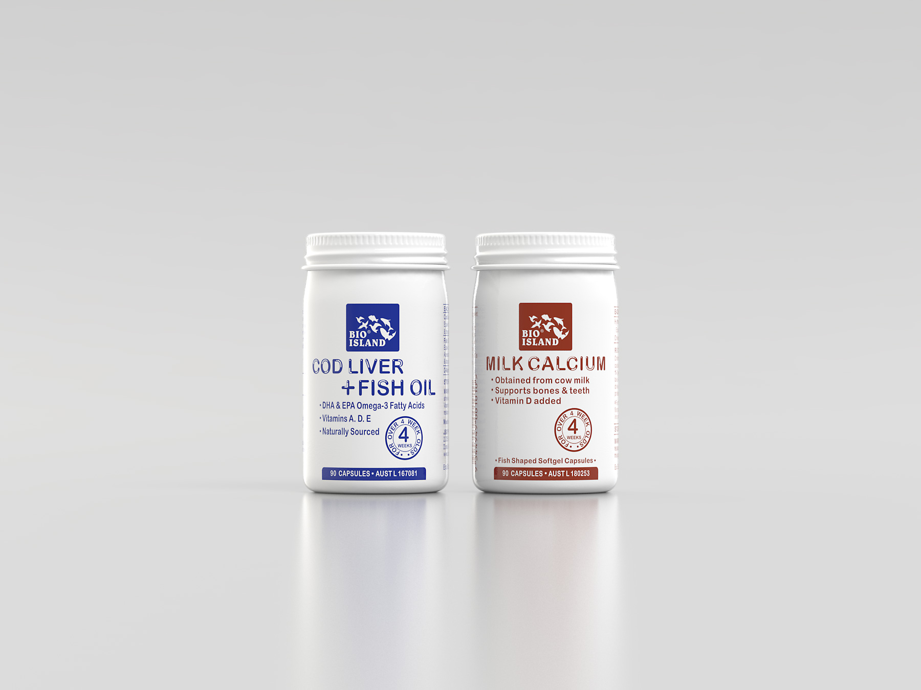
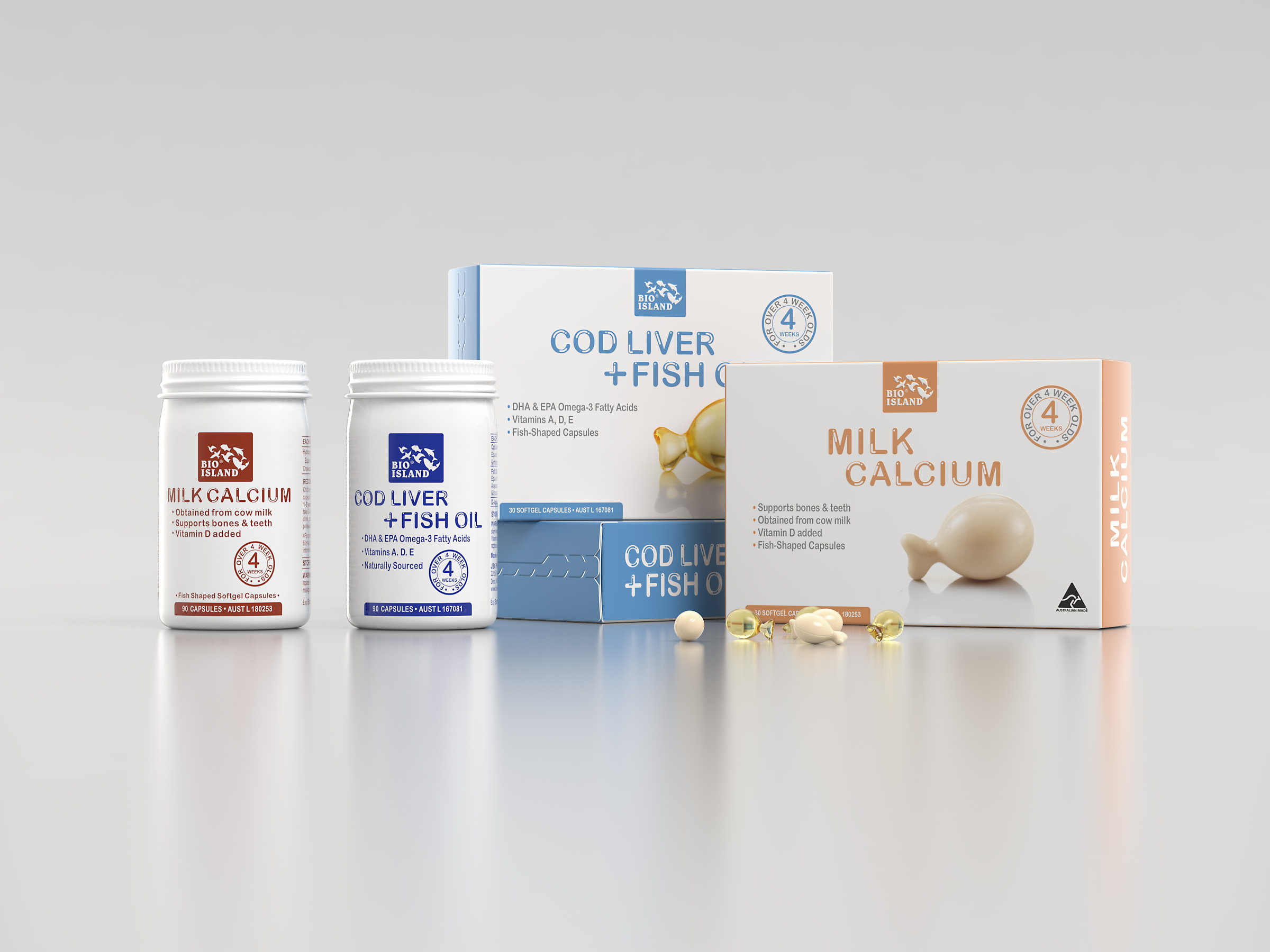
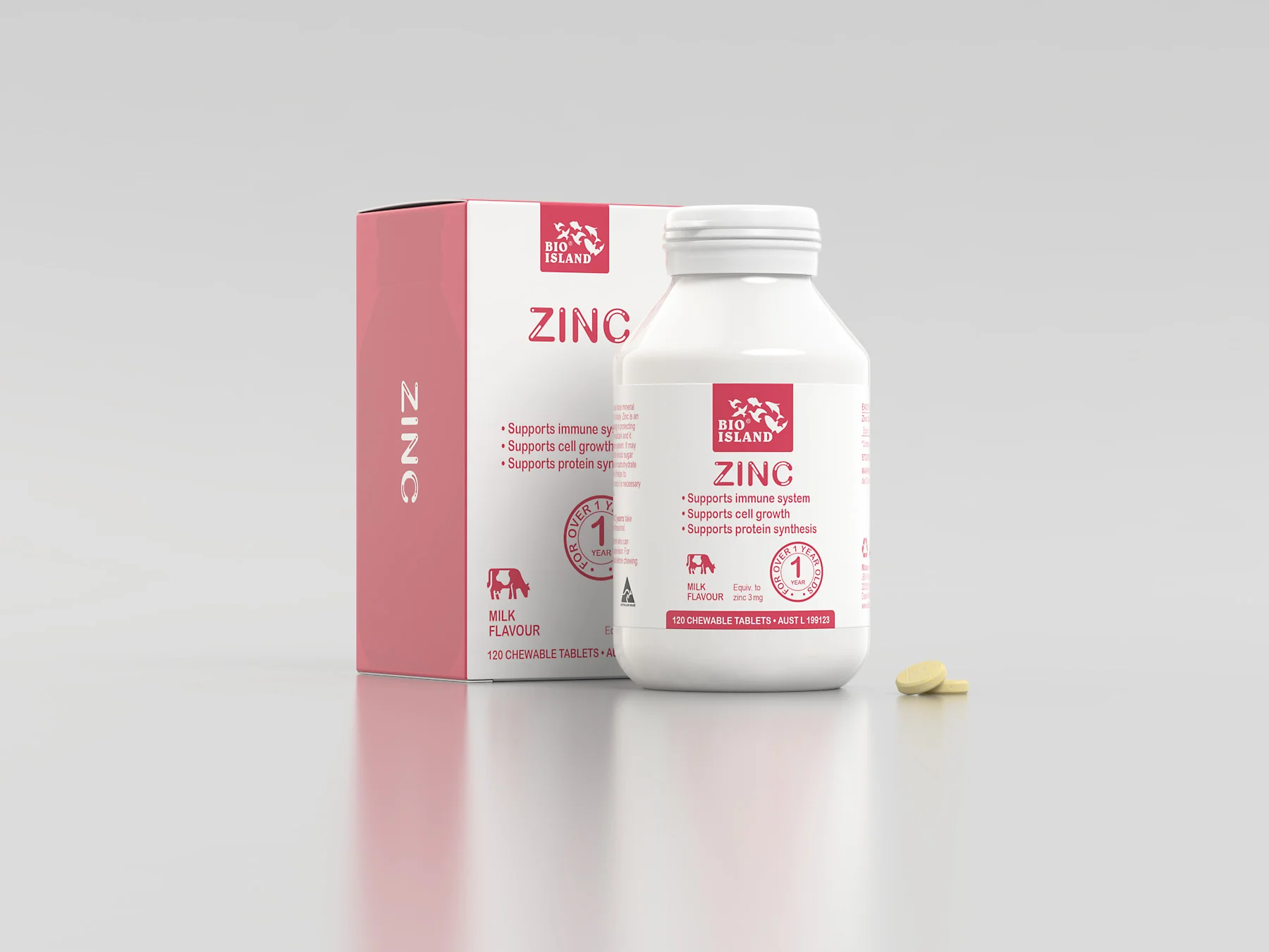
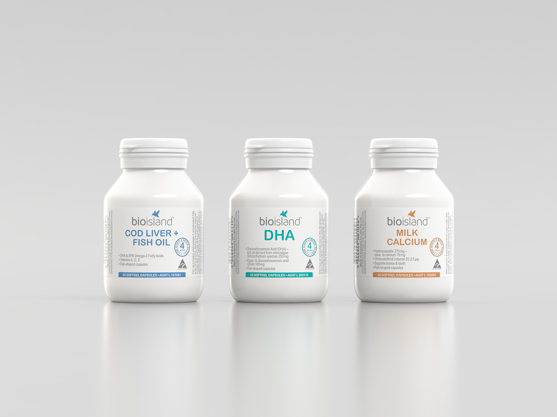
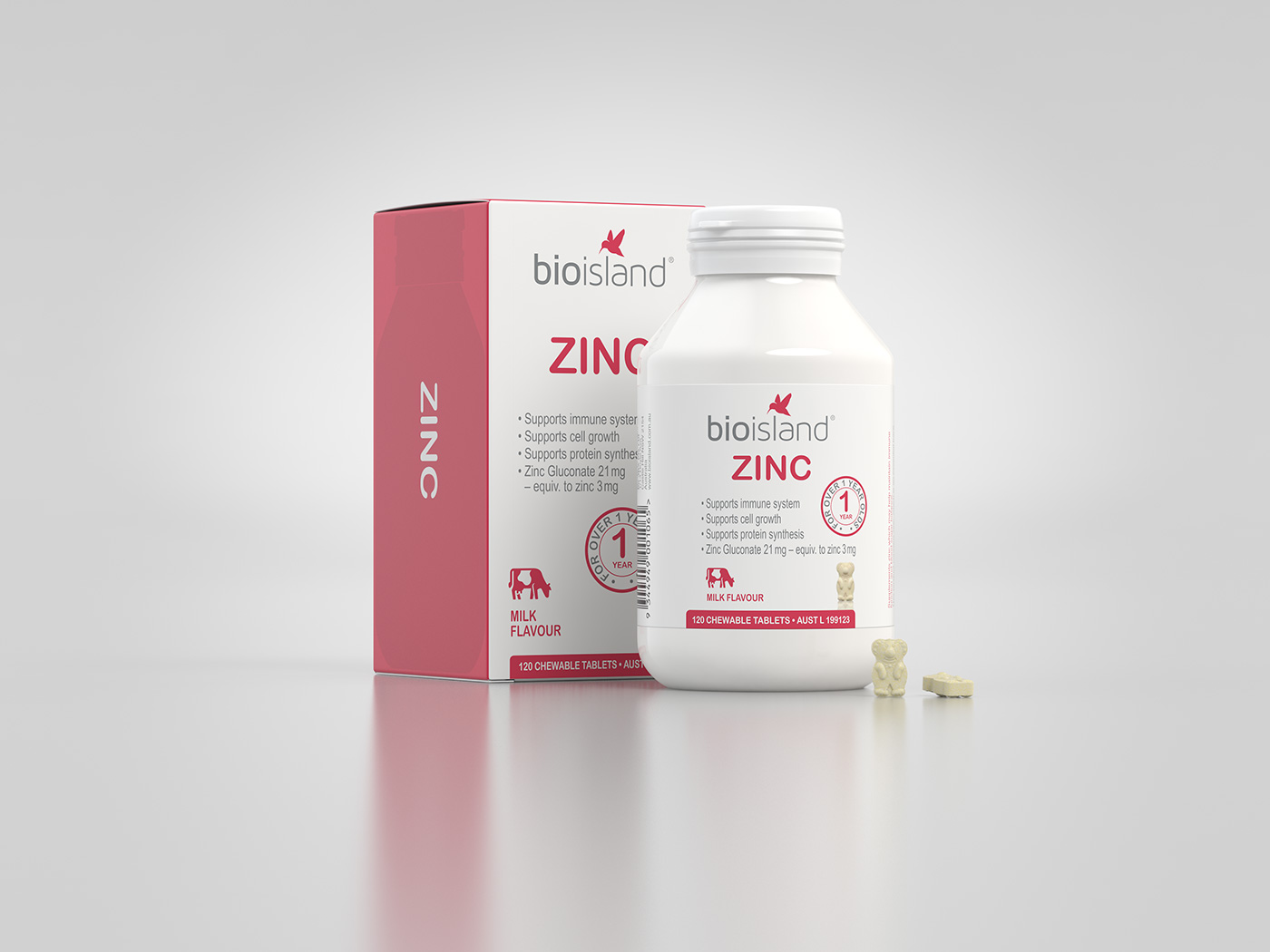
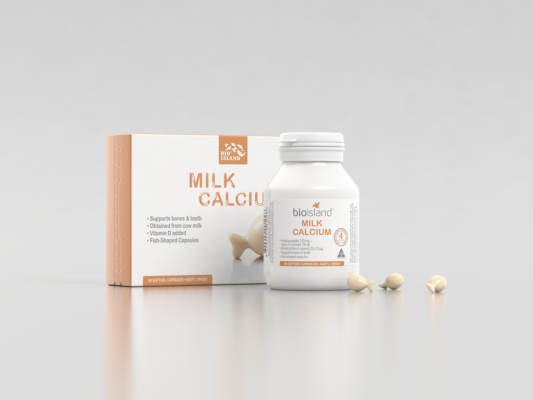
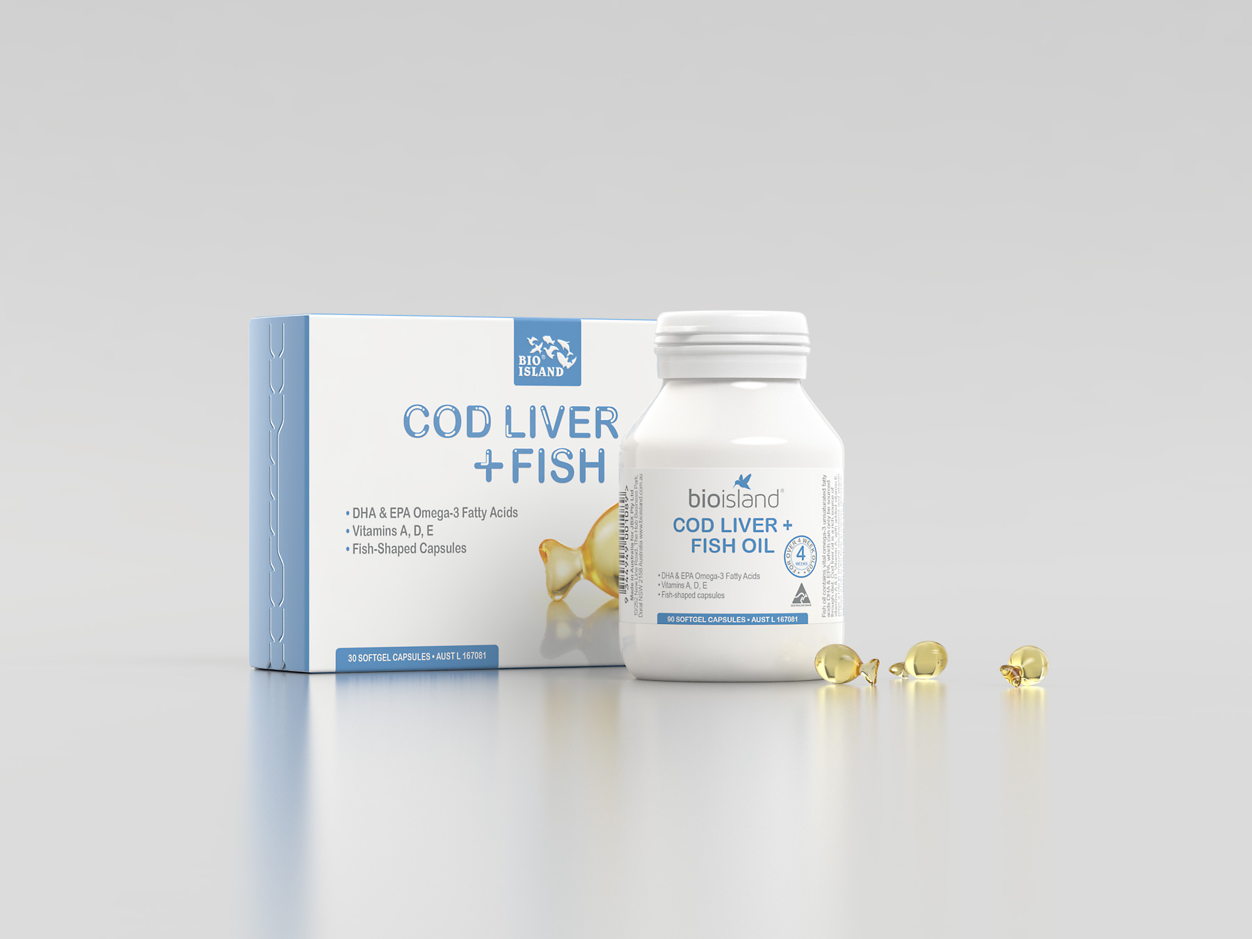
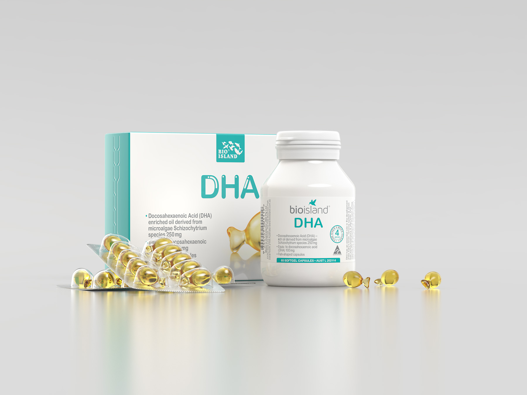
Bio Island kid's range is specifically developed to cater to kids' needs as they grow and achieve the best possible health. Our first brief was to refresh the packaging graphics and apply to a new carton that would replace the legacy tins. At this point a new DHA product brought the range up to three products. Next Zinc was added, this time in a large boxed bottle.
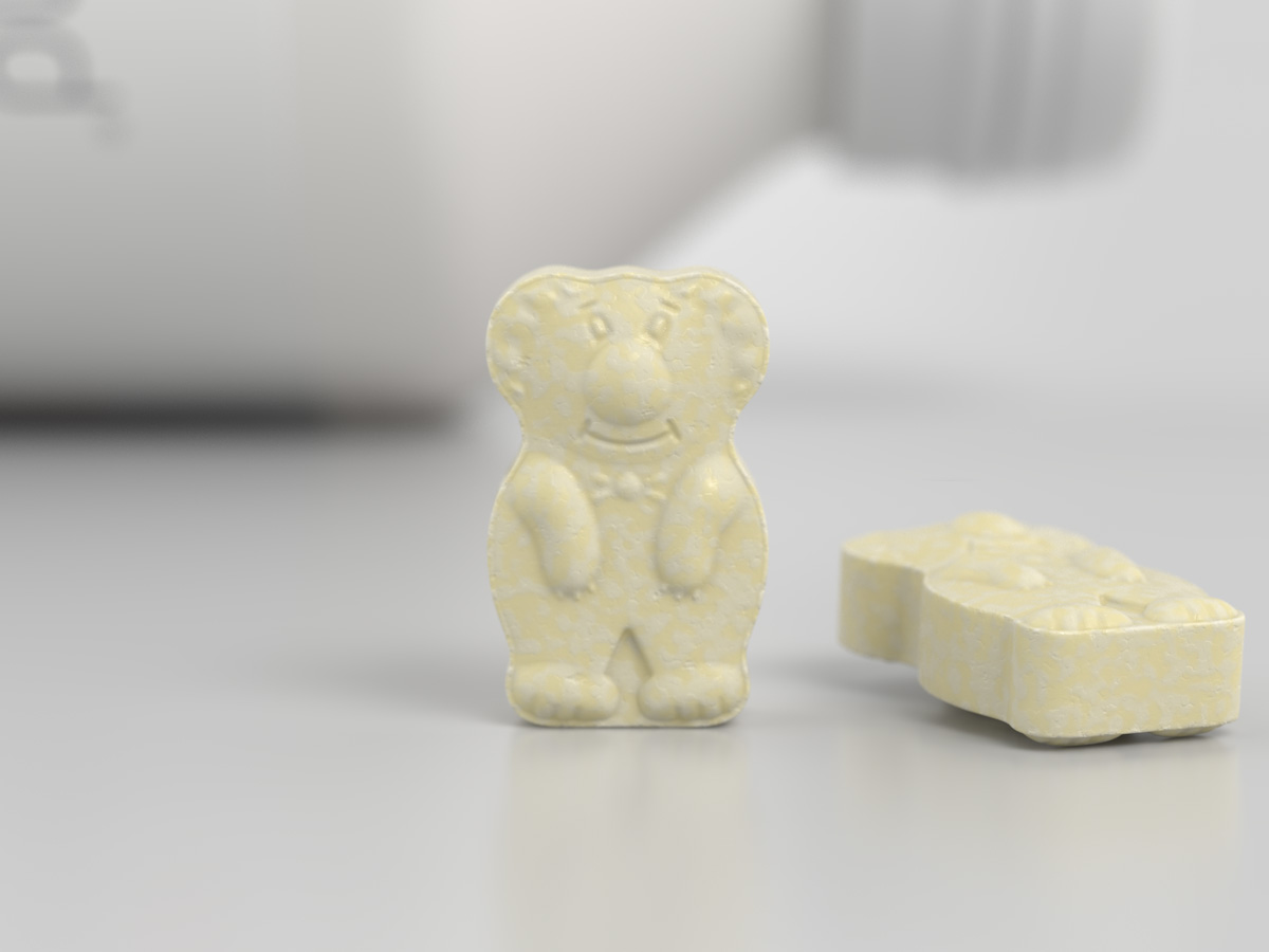
A couple of years after the initial project our client asked us to modernise the packaging by redesigning the Bio Island logo and labelling graphics for three new compact bottles to replace the existing cartons. We also refreshed the Zinc bottle for the new logo and bear shaped tablet.
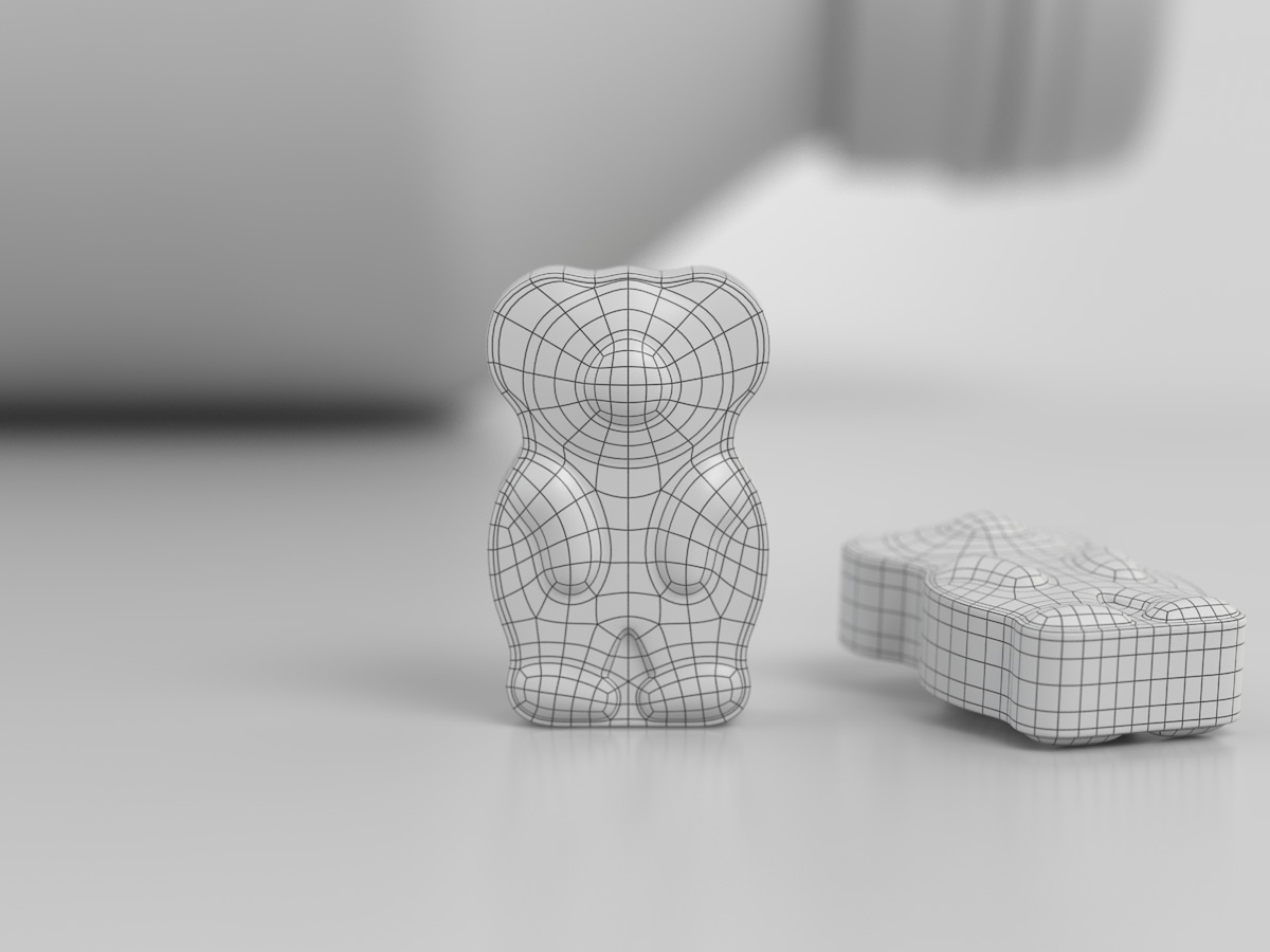
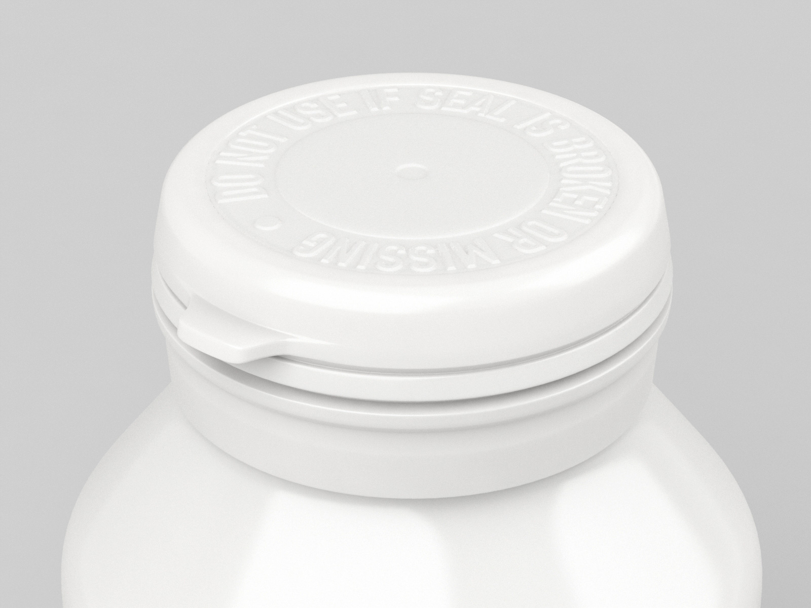
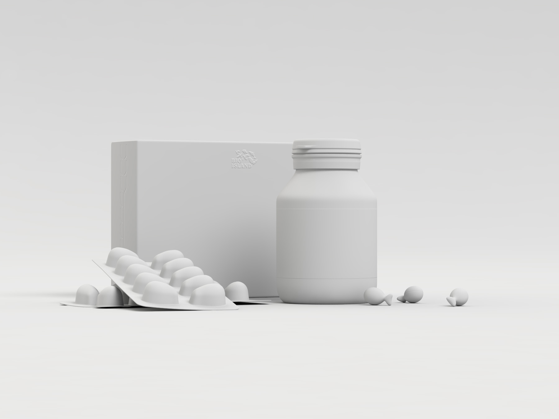
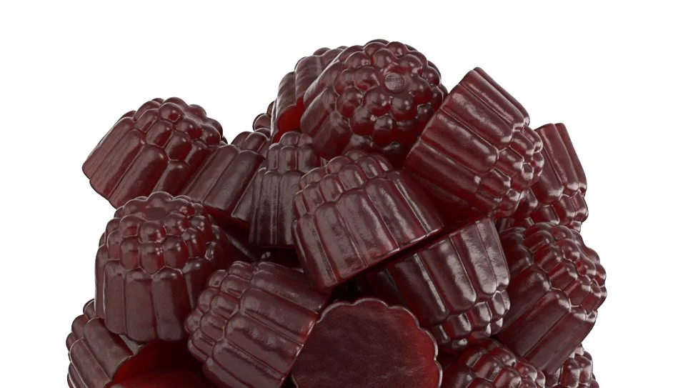
Concepts and final product images were modelled and rendered in Modo, allowing production of website, and related marketing materials before production was complete.


