New client Giovanna came to us frustrated with her current logo, website, signage and branding in general. She wanted a clean, flexible identity that reflected her studio's style. We suggested there was plenty worth salvaging and that a cohesive but playful evolution, not a revolution, was all that was required.
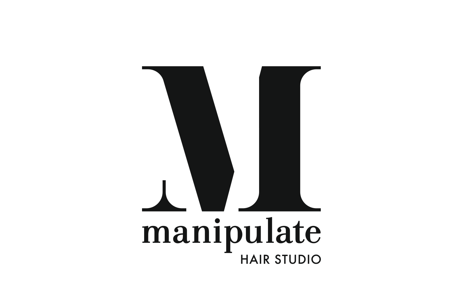
We looked at the existing logo, identified the font and redrew or customised the letterforms to maintain the elegance of the original but reproduce better onscreen and at smaller sizes.
We then created variations on the logo, with and without the additional wording and applied a family of colours and textural treatments. On stationery and signage we used the simplified logo, masking warm coppery tones of flowing red hair. The business card information was streamlined and printed on high quality uncoated stock to allow writing on the back.
We rounded out the project with an update to window and building signage, menus and client cards. We are currently working on a slick new website that will be both modern and easy to maintain.
Our new window logo signage and super size vinyl promotional panel has had a very positive affect on foot traffic.
Updated lightbox provides consistent branding and increased visibility.


